Communication is an intricate part of Product management. If you’ve been reading my articles, you’ll know that I emphasize the following adjectives to describe your communication: subtle, concise, and correct. Over the last 10 years, I’ve spent honing my communication skills as much as I have spent developing my product skills. And it has reaped benefits.
As far as communication skills go, visual and written play the most important role. Verbal improves as your visual + written improves. Remember, your primary communication with your stakeholders & development team is written. It is then the written + visual communication that you should focus on.
For the rest of the article, I’ll combine written + visual communication skills into presentation skills. You are ultimately presenting your thoughts to the audience for their consumption. Presentation skills are not limited to a PowerPoint, they extend to your stories, your grooming, and even your updates email!
Elements of Product Communication
Let’s look at the various elements of communication, ordered by their priority:
1. Simplifying complexity
When you write something, think of the consumer. There are certain frameworks they use to simplify things in their head. They cache some information in their head to parse the subsequent message. There is a context that they hold. For example, talking about a guest users’ interaction right after talking about a logged-in user interaction forces them to switch the context. However, if you’re vague about the context switch, they’ll never clear the cache in their head.
Compare the two stories:

While both stories elaborate on the same ideas, they are different in the following ways:
- Story 1 requires internal translation. The developer has to read and hold in their mind the exact user type (saved their card details in a previous transaction, which translates to someone who has logged in, has a saved card and has a transaction)
- “the ability to select the saved card” is essentially ‘use the saved card’
- “Transact faster” introduces a separate element of tracking time-to-transaction. Opens other avenues of discussions!
The second story, on the other hand, leaves nothing to the imagination. It doesn’t open more avenues of discussions. It is clear.
Thinking from the consumers POV
The following can be considered as a usual expectation from the consumers of the story:
- When developing, do I know the cases where this situation exists?
- When designing, do I know the expected interaction?
- When testing, do I know the outcome?
It is up to you to decide how simple you want to make your stories. But make sure they answer all the questions above, especially more if the users have been explicit about them in the past.
Side note: I recommend you invest some time in learning about the INVEST concept of story writing.
Similarly, the following paragraph sent as an update to the business on a newly launched feature:

Arguments exist for both styles. But the first one leaves space for more questions:
- What period is she comparing this to?
- What is the current volume of transactions?
- What is the current bounce rate?
Thinking from consumers POV
Your update is meant to be used as a talking point for whoever is consuming this report. While the 3 lines above are sufficient to convey the core objective (everything is rosy), it is not enough to field subsequent questions. The second style, which is clearer and can be referenced anytime, is favored over verbose comprehension that is the first style.
Imagine if you were to talk about the feature in a meeting to your CEO. Armed with only the information from the first style, you’ll be forced to check with the team if the CEO asks any more questions! Simple questions like the above are enough for you to say, “I’ll find more information and get back to you’. You do not want to be in that position.
2. Logical flow
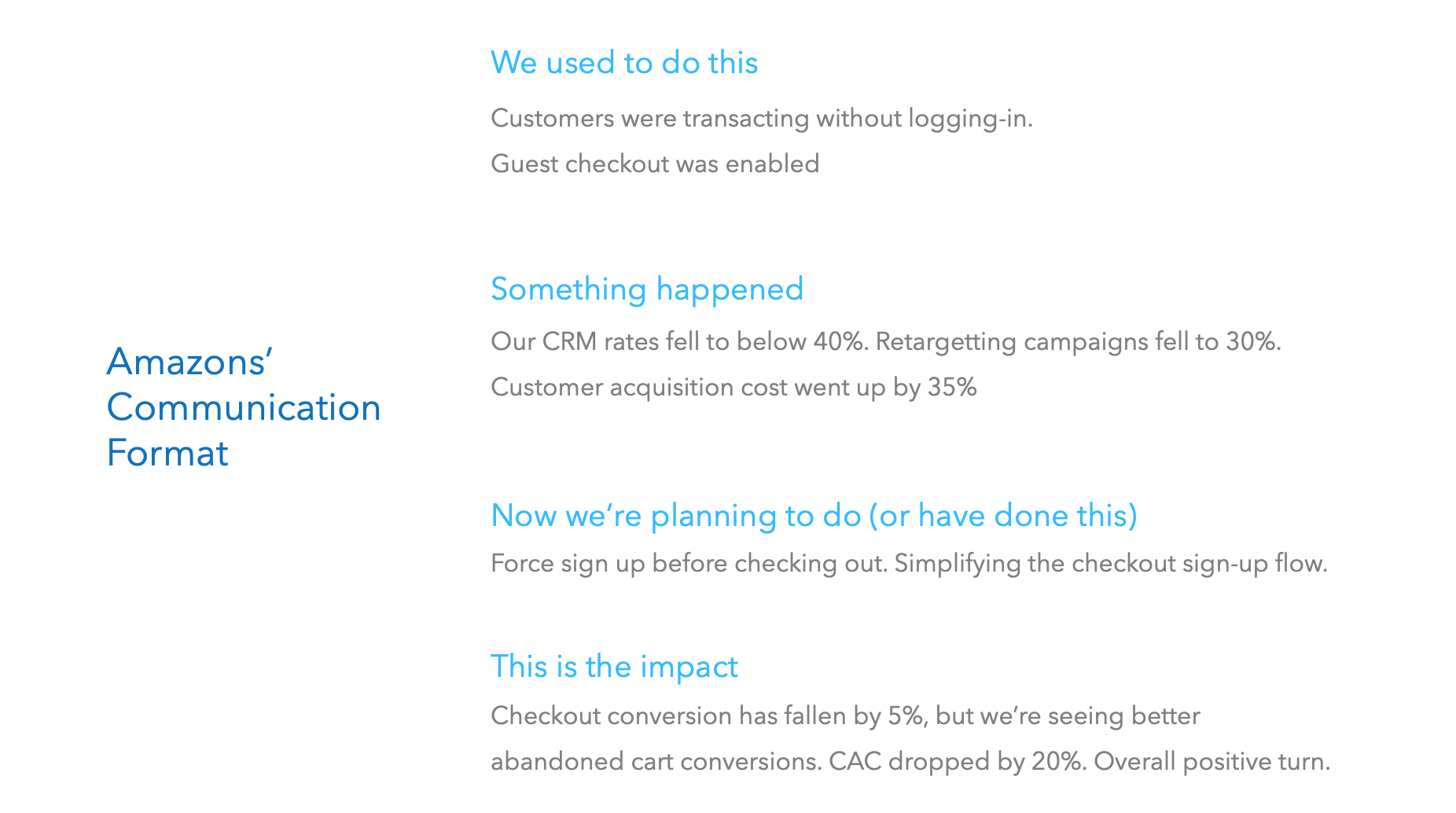
Your communication needs to have a logical flow to it. The popular Amazon format of:
We used to do this
Something happened
Now we’re planning to do (or have done this)
This is the impact
is beneficial when communicating. This format lays down the common principle of communication: provide a logical context. Your entire presentation fails if you do not provide context.
Example:

This format works really well even when you’re sending out communication to the stakeholders.
3. Visual communication
A picture is worth a thousand words. What you can say using words, can be better explained with a simple graph or a wire-prototype. Again, the objective is to clear & concise and leave no room for questions.
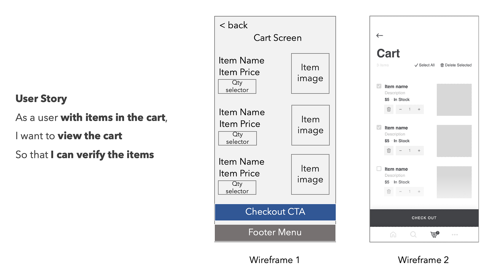
In the beginning, there were hand-drawn prototypes, made famous by Balsamiq. Nowadays, a prototype such as the one below can be visually irritating and doesn’t convey the intention. These are jarring pieces of information.
Compare these two wires:

Putting yourself in the shoes of a developers/designer, would you like the first one or the second one? Sure, designers will argue that this puts a lot of bias on them on layouts, but the first one does them no favors! The level of detail in the first one is minimal and you’ll ask 10x more questions on the elements themselves before focusing on the story itself.
This also brings in more elements that the developer/designers can incorporate when designing/developing.
4. Labeling
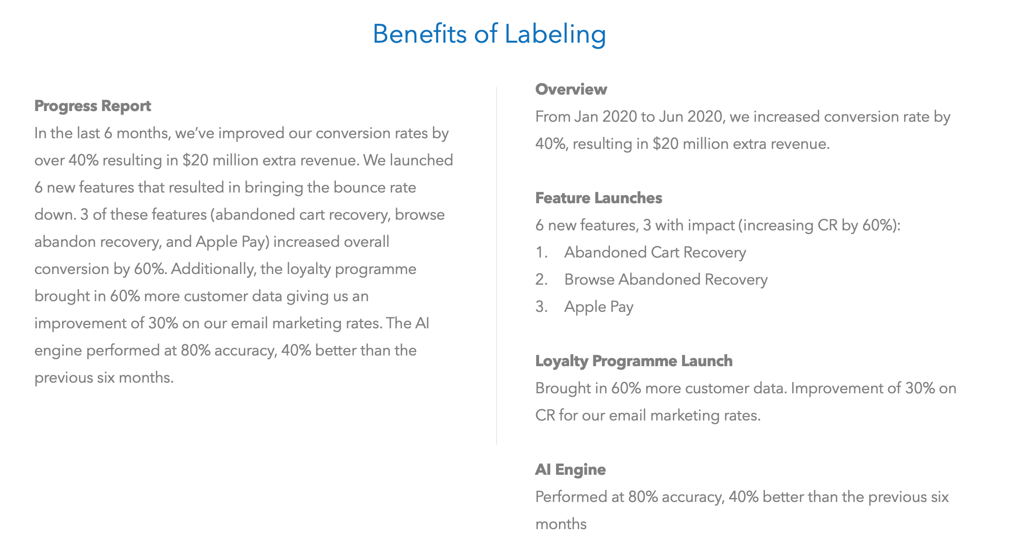
Labeling your ideas goes a long way to contextualize the information. You can say, ‘Now we’ll look at the labeling aspect of communication’ OR you can simply write ‘Labeling’ and give it a headline font style.

Having read only the left-hand side, answer this — what is the impact of the Loyalty program on Email Marketing? You’ll need to sift through the data to find out which section of the paragraph talks about the loyalty program.
The one of the left gives you information immediately. It’s the same information… just presented better.
Honing your design skills
Let’s face it — most of what you do is related to the interface. Every technology marvel you scope, has an impact on your interface. Doesn’t it make sense that you focus on your design skills? As mentioned before, your presentation skills are paramount when it comes to communication. If your presentation skills are a function of how good you can convey your point, doesn’t it make sense that you develop them?
3 ways to hone your design skills
Here are my 3 recommended ways to hone your design skills:
1. Pick an app/site you like and design the wireframes for it
You can use a free tool like Figma or get creative on Powerpoint/Miro etc. Look at the site and design beautiful looking wireframes. Keep doing this till you get comfortable with a tool. I can wireframe in Figma, Powerpoint, and Miro, with varying degrees of complexities. Make wireframing second nature.
2. Get & incorporate feedback from your design/development team
If the team is willing, ask them for feedback. People love to give feedback. Incorporate the changes they’ve given and return to them. Contextualize that, this for you to write better stories and convey your point better.
3. For your subsequent stories, build beautiful wires
You need not get into specifics, but at least make them palatable. You’ll find a wireframe design opens you up to more thought and questions that come up in the grooming. Answering those beforehand will help you be great at your job.
Improving your communication takes a while. Through constant feedback you can reach a level of simplification in your head that’ll leave the readers surprised at the simplicity of the communication. The right time to start is now!
Another thing to note here is that your verbal communication will drastically improve if you incorporate the above elements in your presentation skills. Only when you have clarity of thought can your verbal communication be clear. Writing makes it easier for you to break down the complexities of thought.
Thank you for reading. I encourage you to write frequently. Remember, as with everything else, the gains are marginal to begin with… over time, the results are many folds.
Adding Akshays inputs:
One thing I’ll to add in visual presentation is the flow diagrams.
Dan Roams book Back of Napkin is quite nice for understanding designing principles, along with the book Non designer’s design guide by Williams Robin.
Wireframes are a good point of validation internally (product team) esp when we do something quite new, to ensure information architecture and flow is correct. But it is not something we might want to present to management
Thanks!

